VISUAL IDENTITY
VISUAL IDEN
TITY
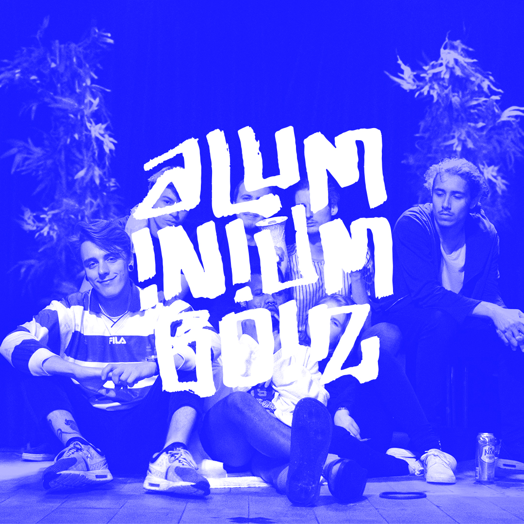
Dutch rap formation in which i participate, as their graphic designer i am in charge of their visual elements and products.
client:
distributed:
assignment:
project:
aluminiumboiz
ALUMEN
Visual Identity
Branding & Graphic Design
ALUMINIUMBOIZ
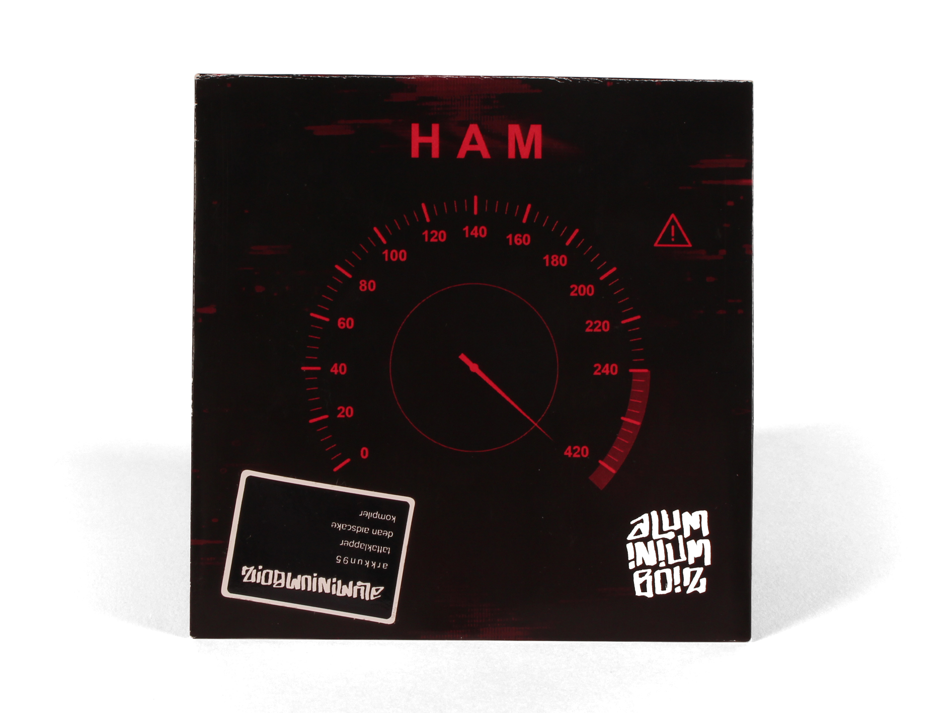
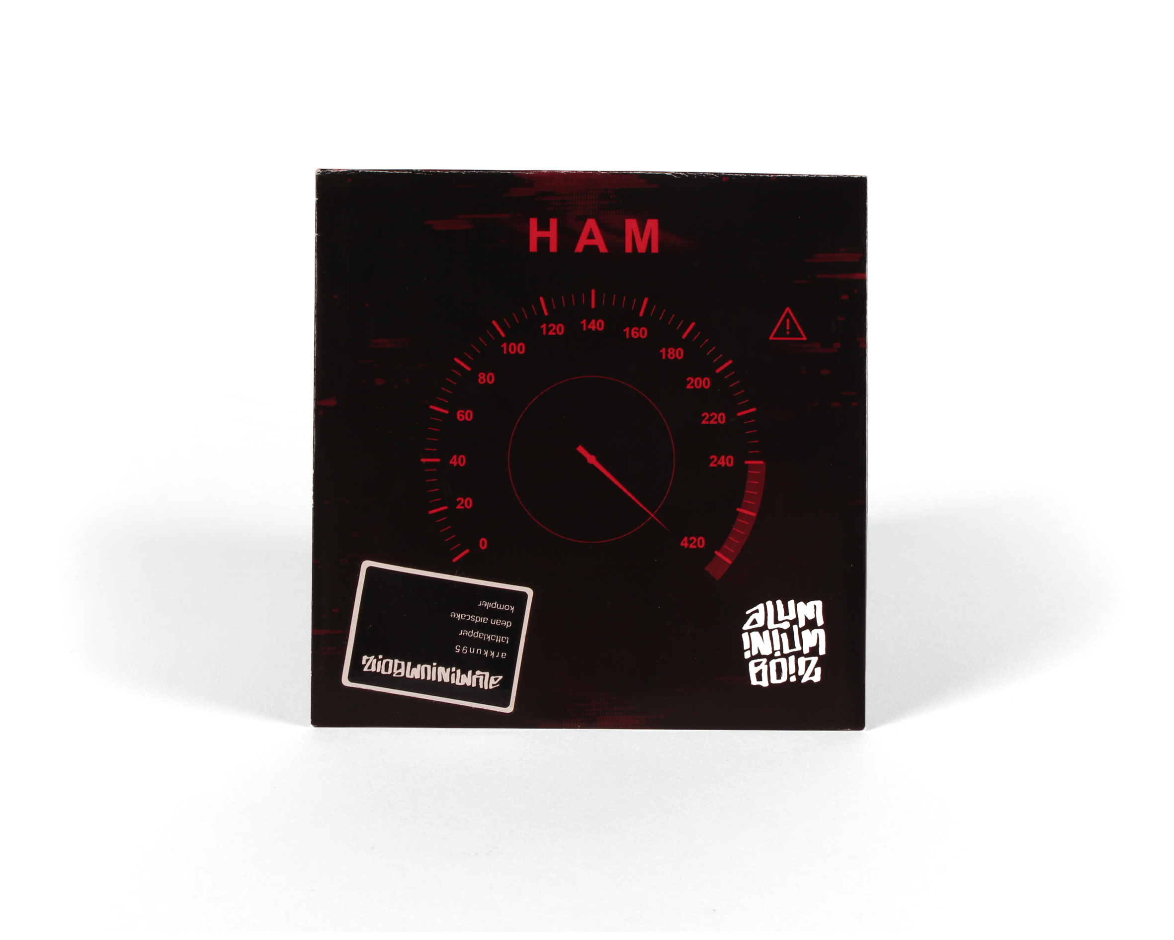
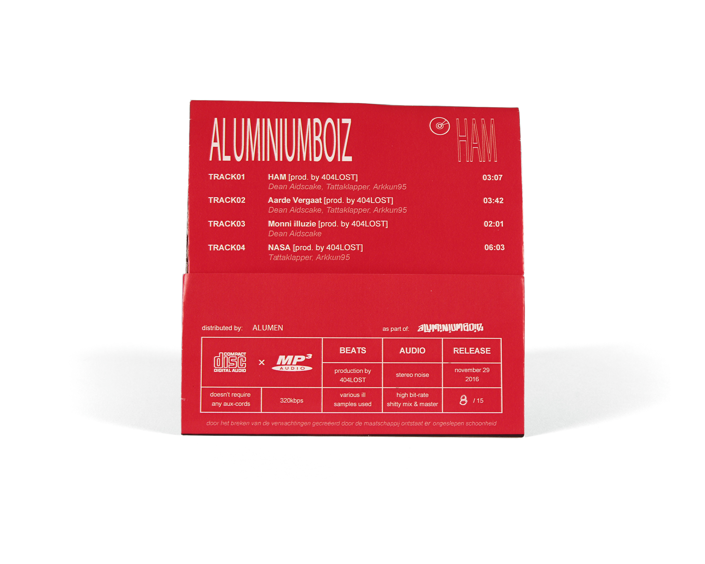
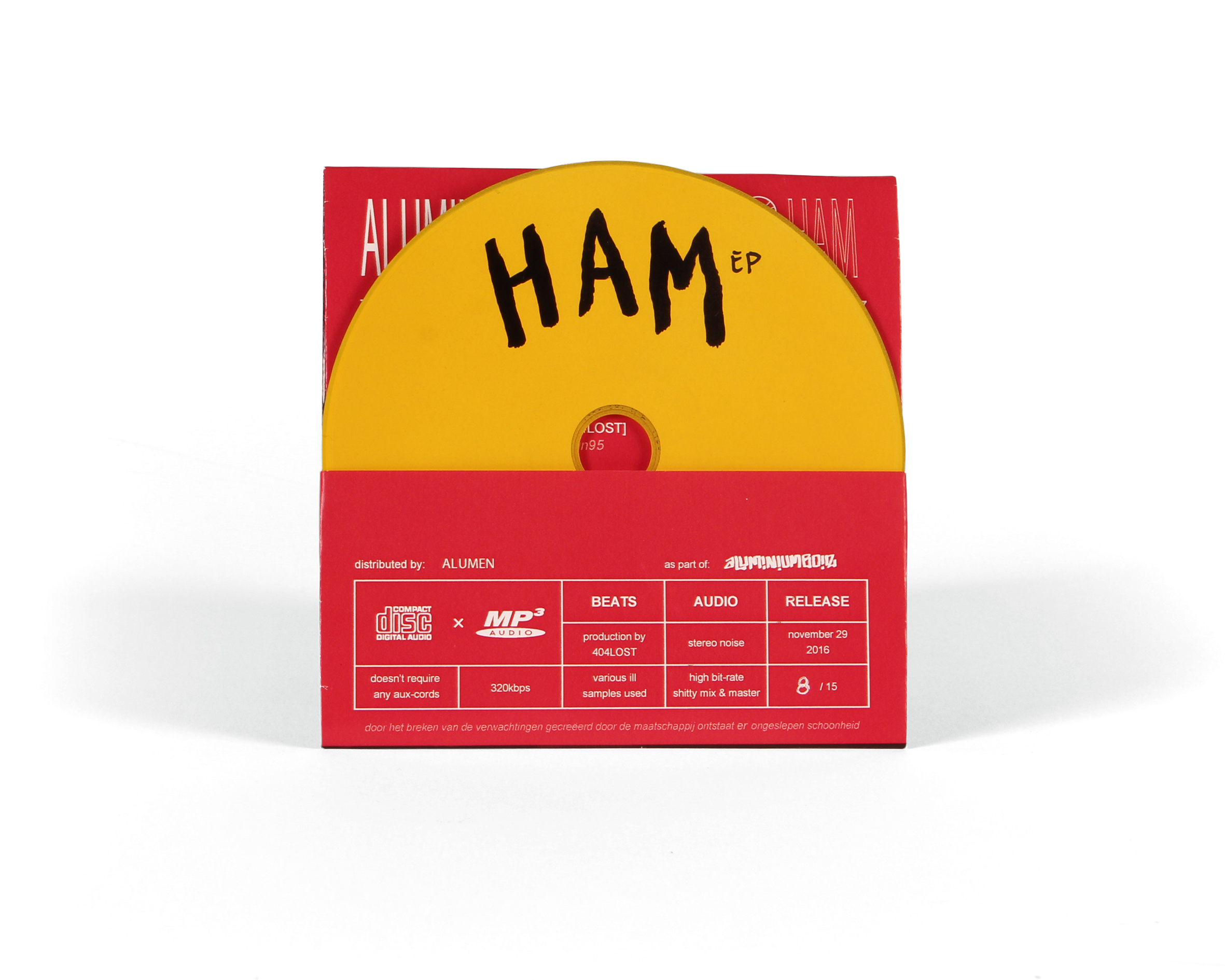
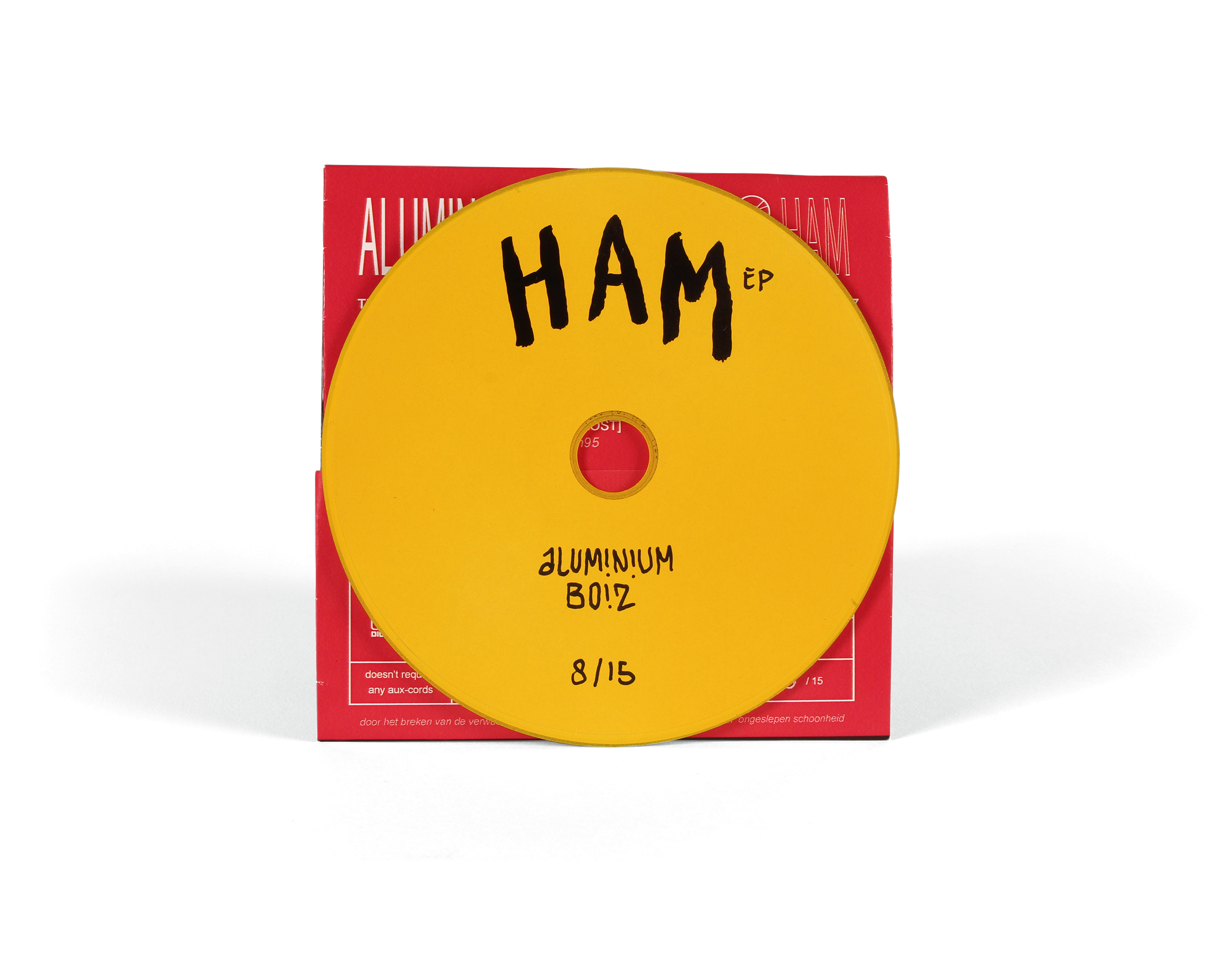
HAM EP
ALUMINIUMBOIZ
HAM EP
ALUMINIUMBOIZ
HAM EP
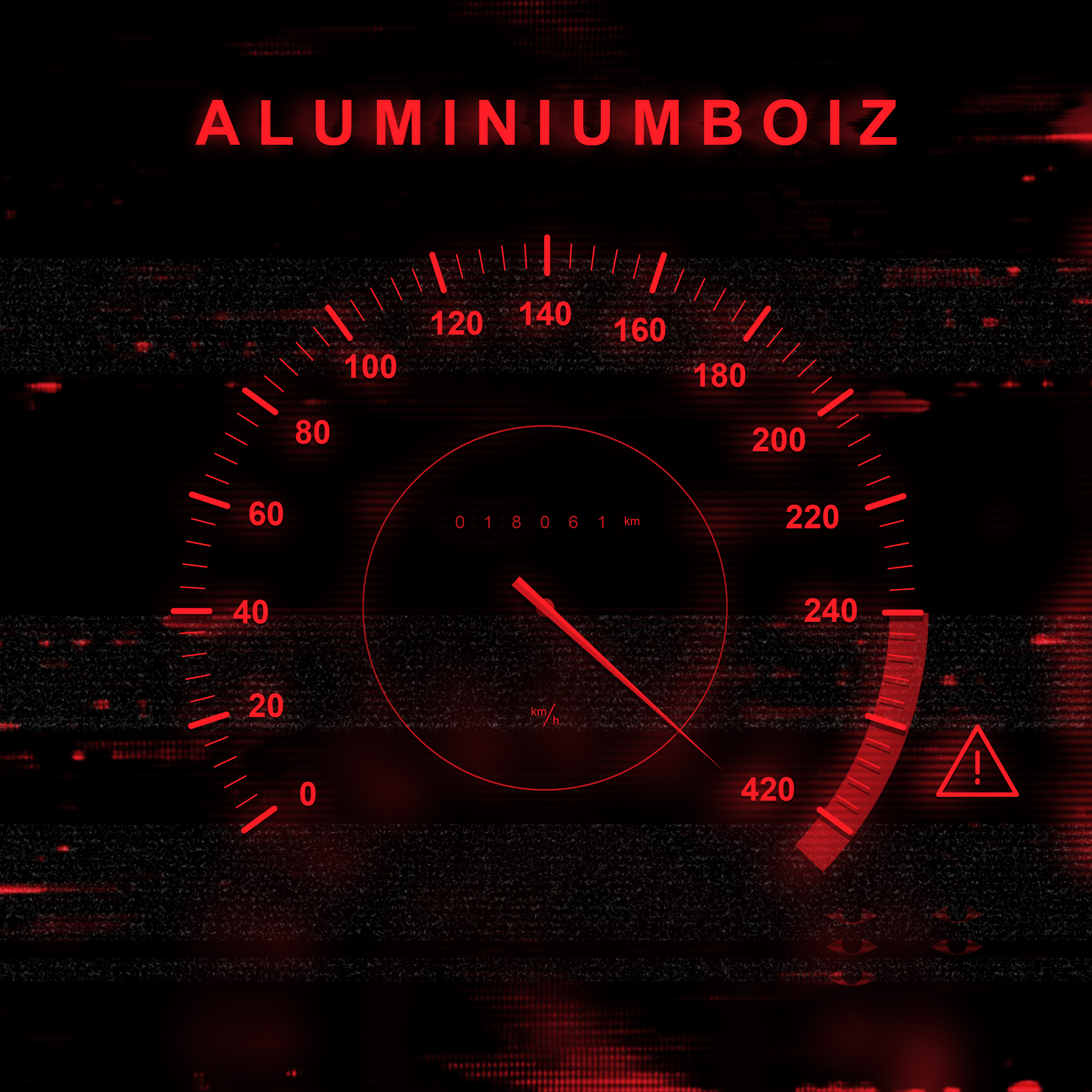
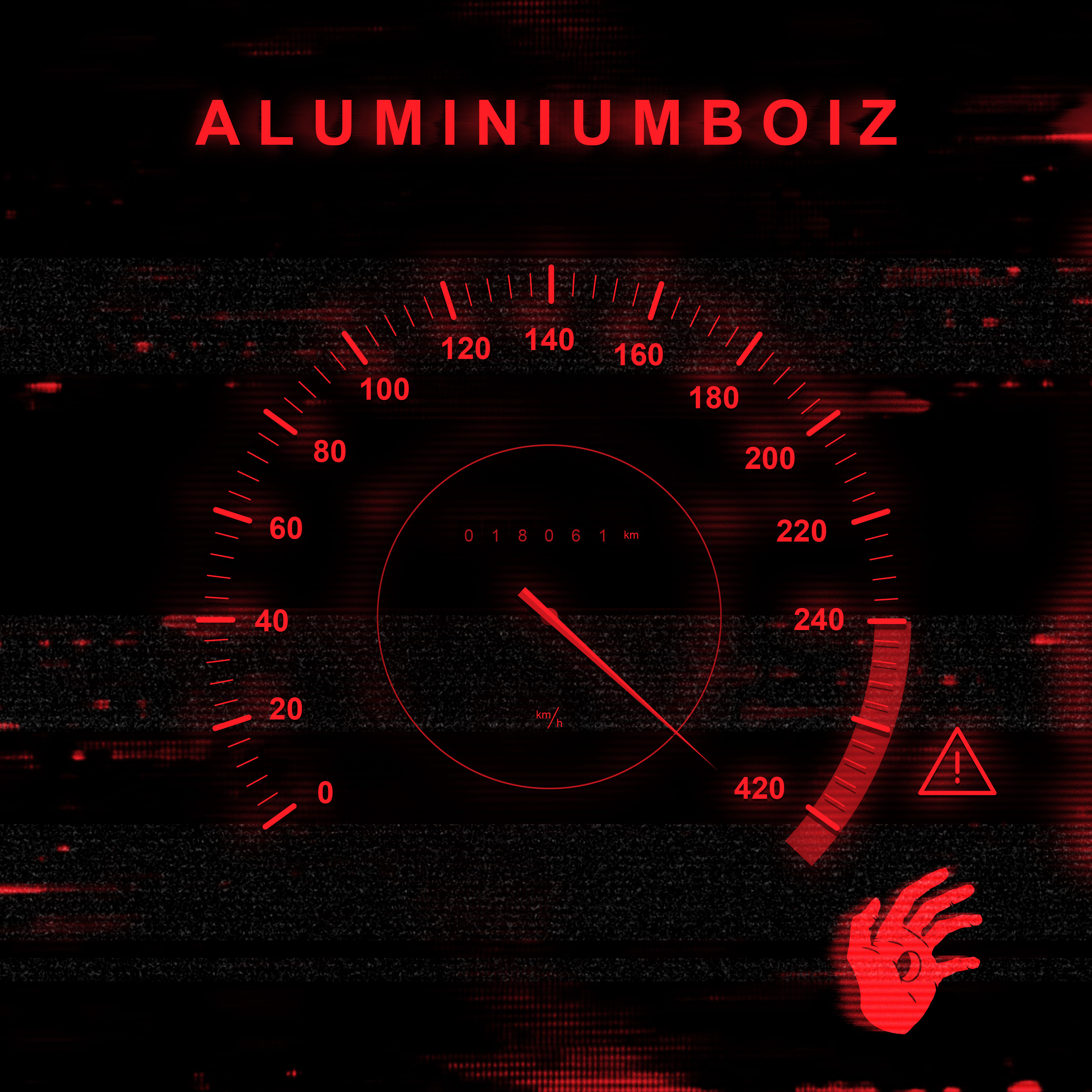
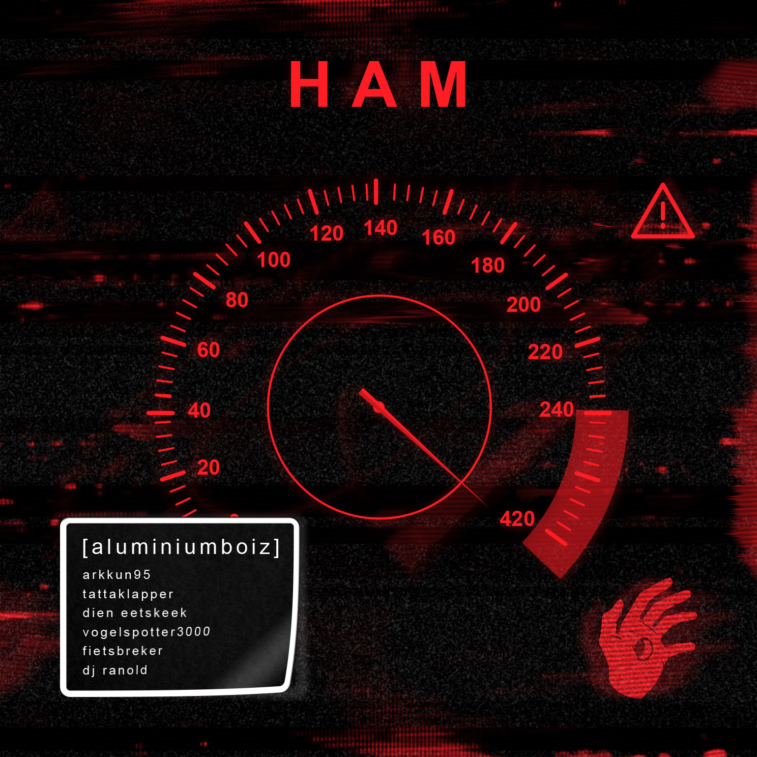
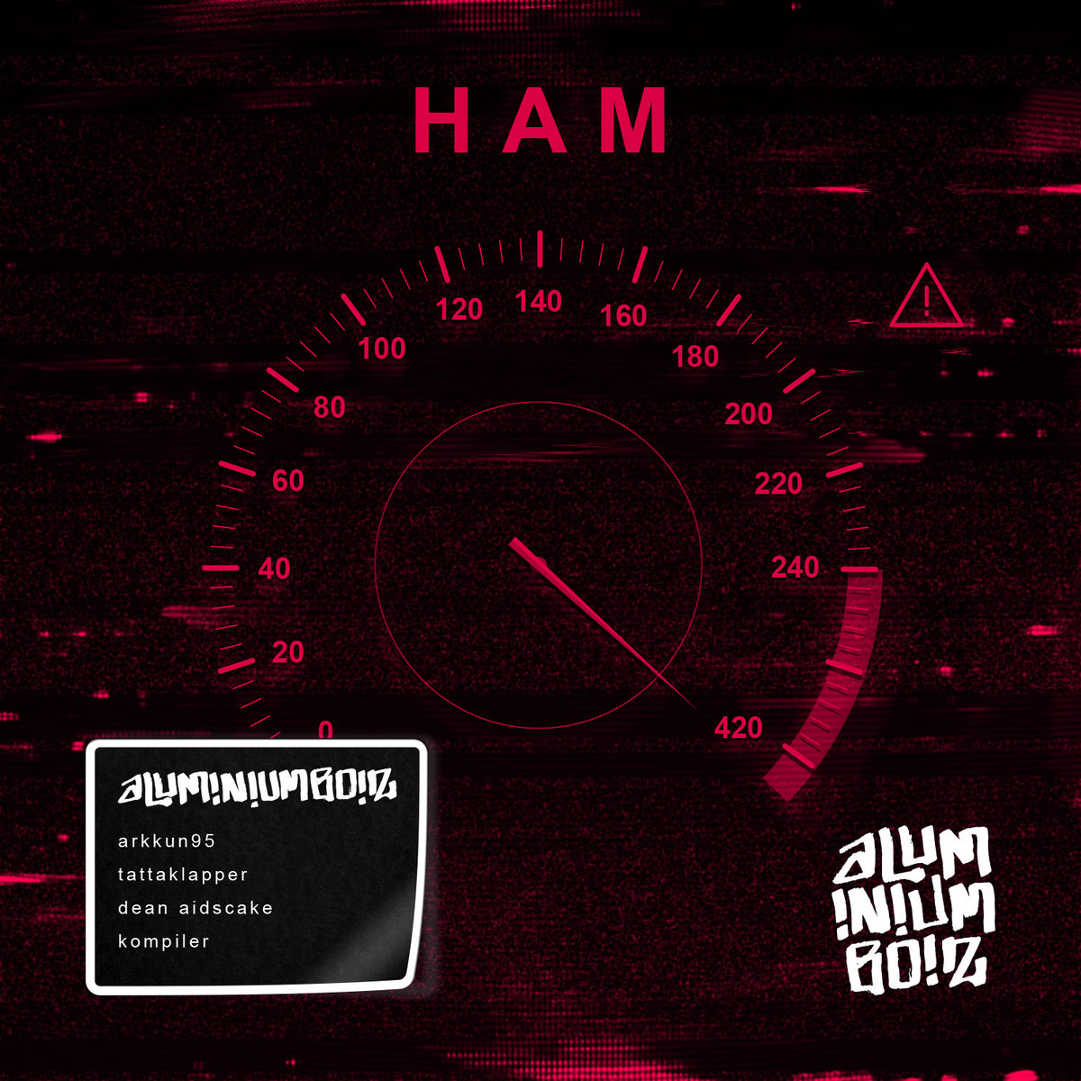
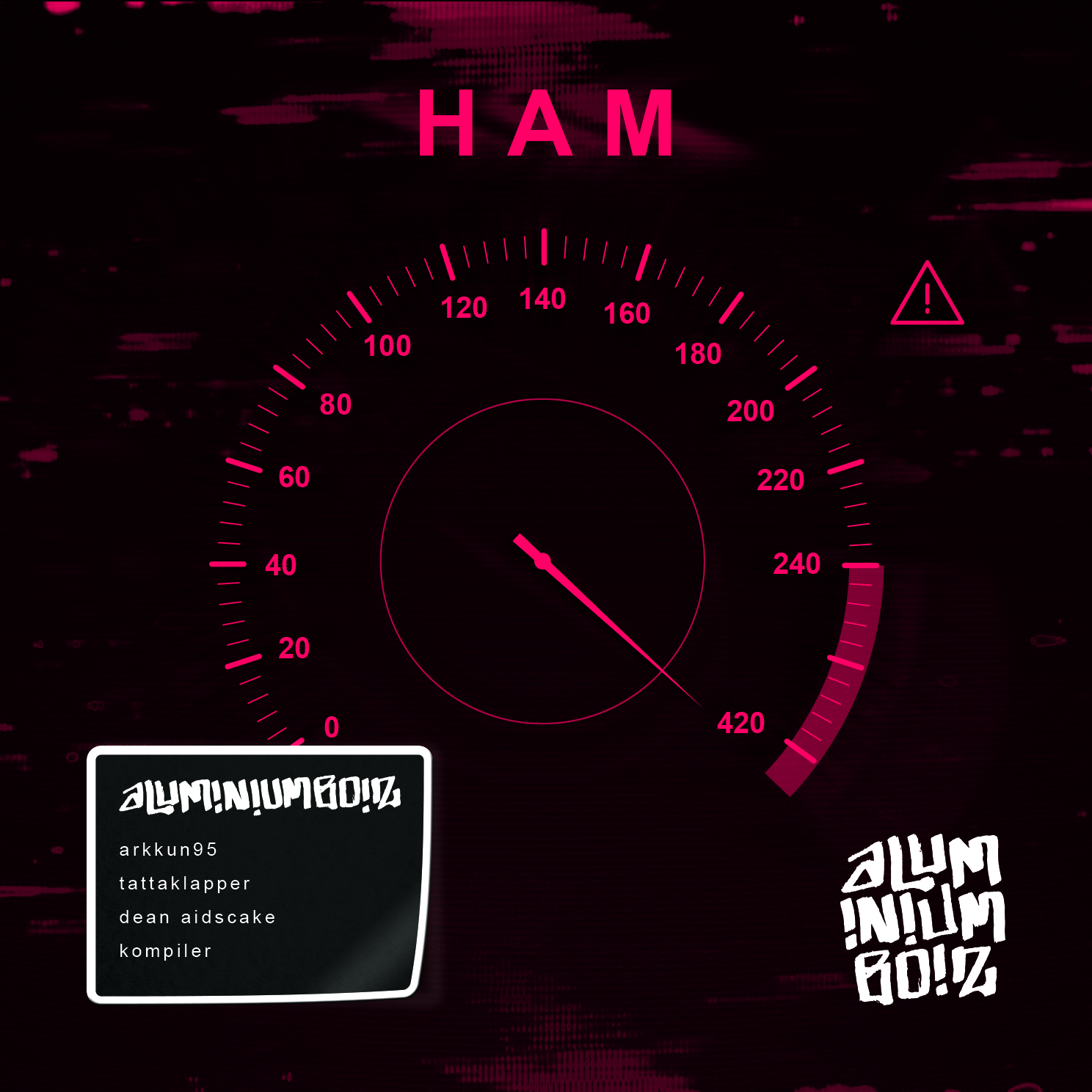
The first EP released by dutch rap formation "aluminiumboiz", the titel HAM is a abbreviation of the sentence HARD AS A MOTHERF*CKER. With this in mind I've designed a speedometer that reaches the speed of 420, the code for smoking cannabis.
The first EP released by dutch rap formation "aluminiumboiz", the titel HAM is a abbreviation of the sentence HARD AS A MOTHERF*CKER. With this in mind I've designed a speedometer that reaches the speed of 420, the code for smoking cannabis.
The first EP released by dutch rap formation "aluminiumboiz", the titel HAM is a abbreviation of the sentence HARD AS A MOTHERF*CKER. With this in mind I've designed a speedometer that reaches the speed of 420, the code for smoking cannabis.
EVOLUTION & ITERATION
A great design comes from iteration and evolutions, to create the cover of the HAM EP I've made multiple different versions. With each and every step you take new possibilities start to emerge within a design, creating new and better options.
1st iteration
4th iteration
6th iteration
finalized design
ALUMINIUMBOIZ
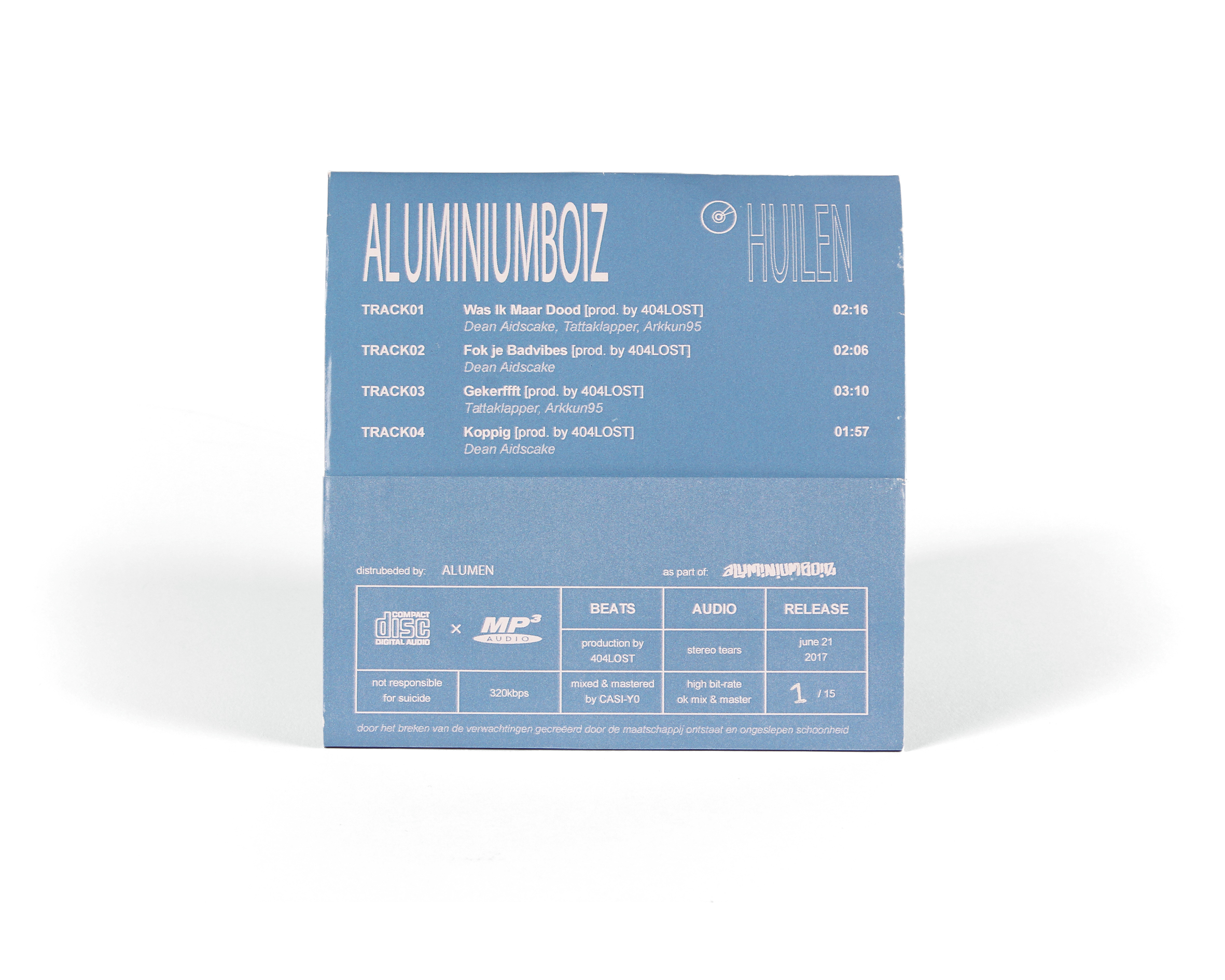
HUILEN EP
ALUMINIUMBOIZ
HUILEN EP
ALUMINIUMBOIZ
HUILEN EP
ALUMINIUMBOIZ
HUILEN EP
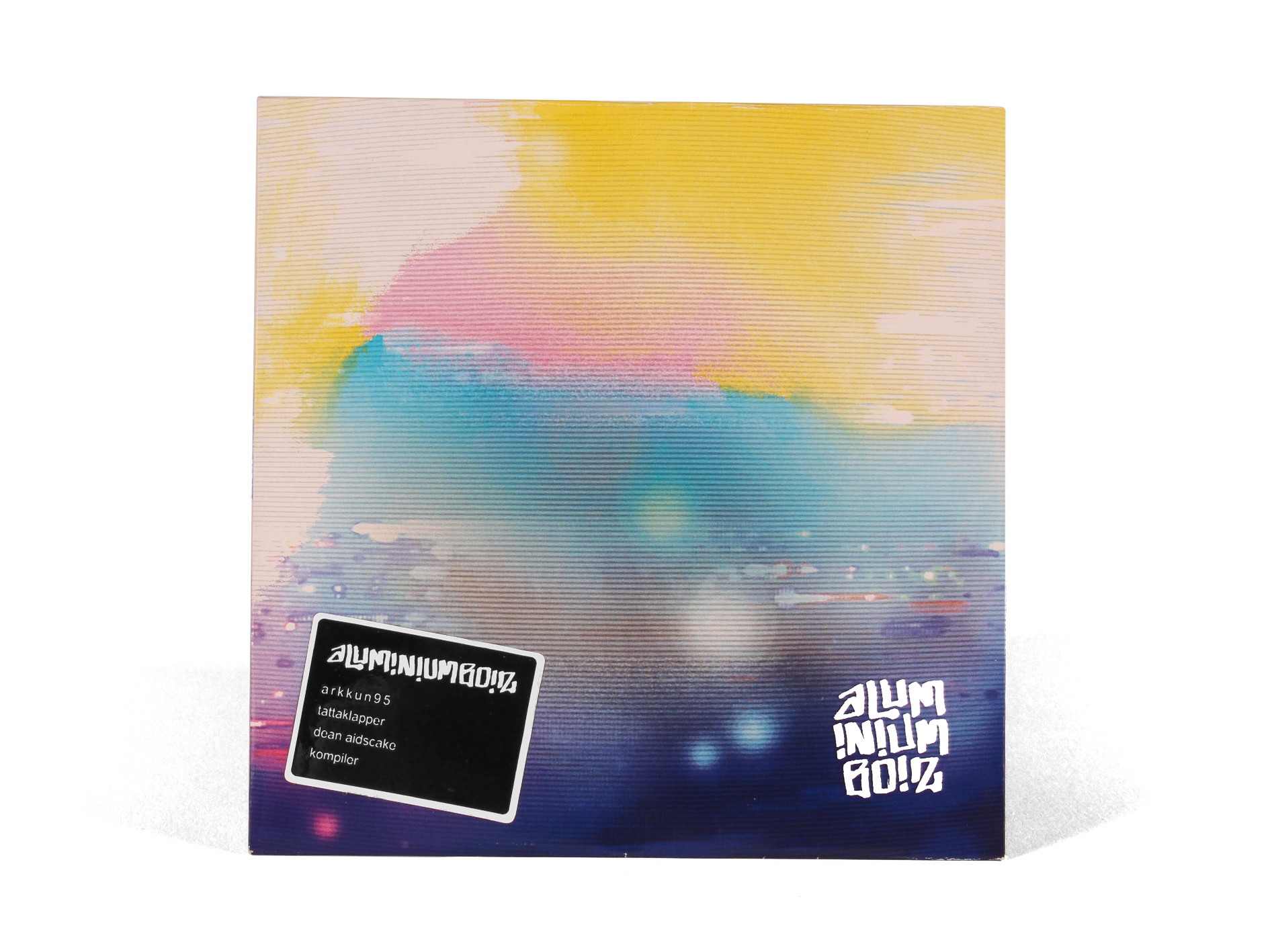
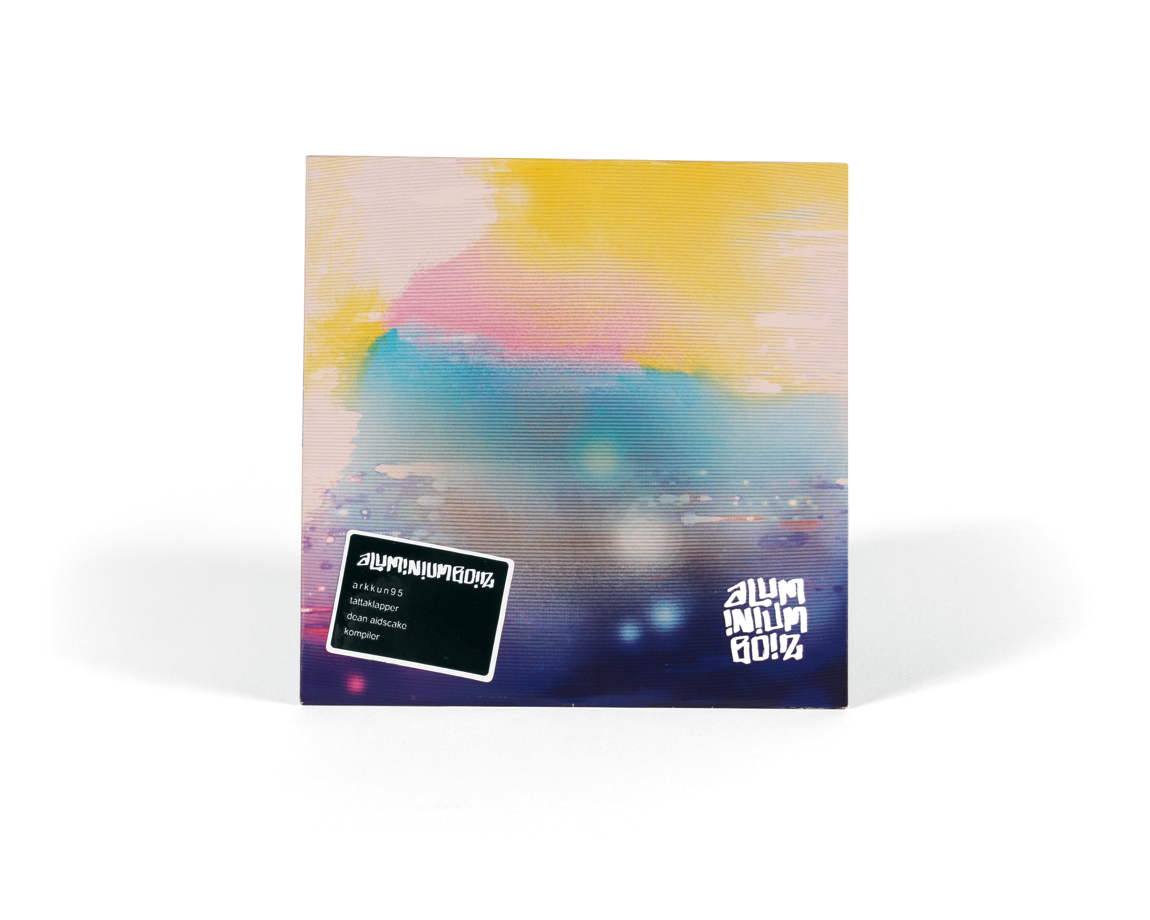
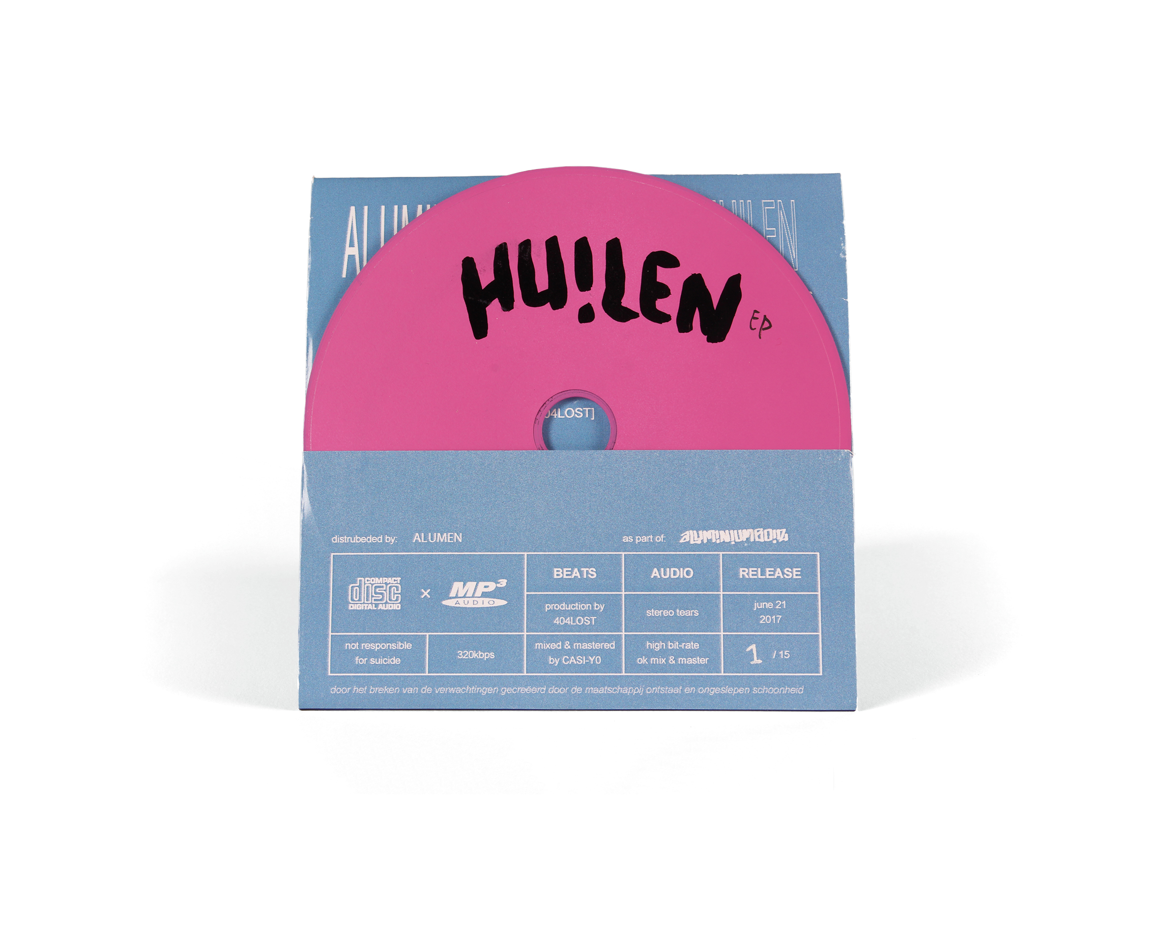
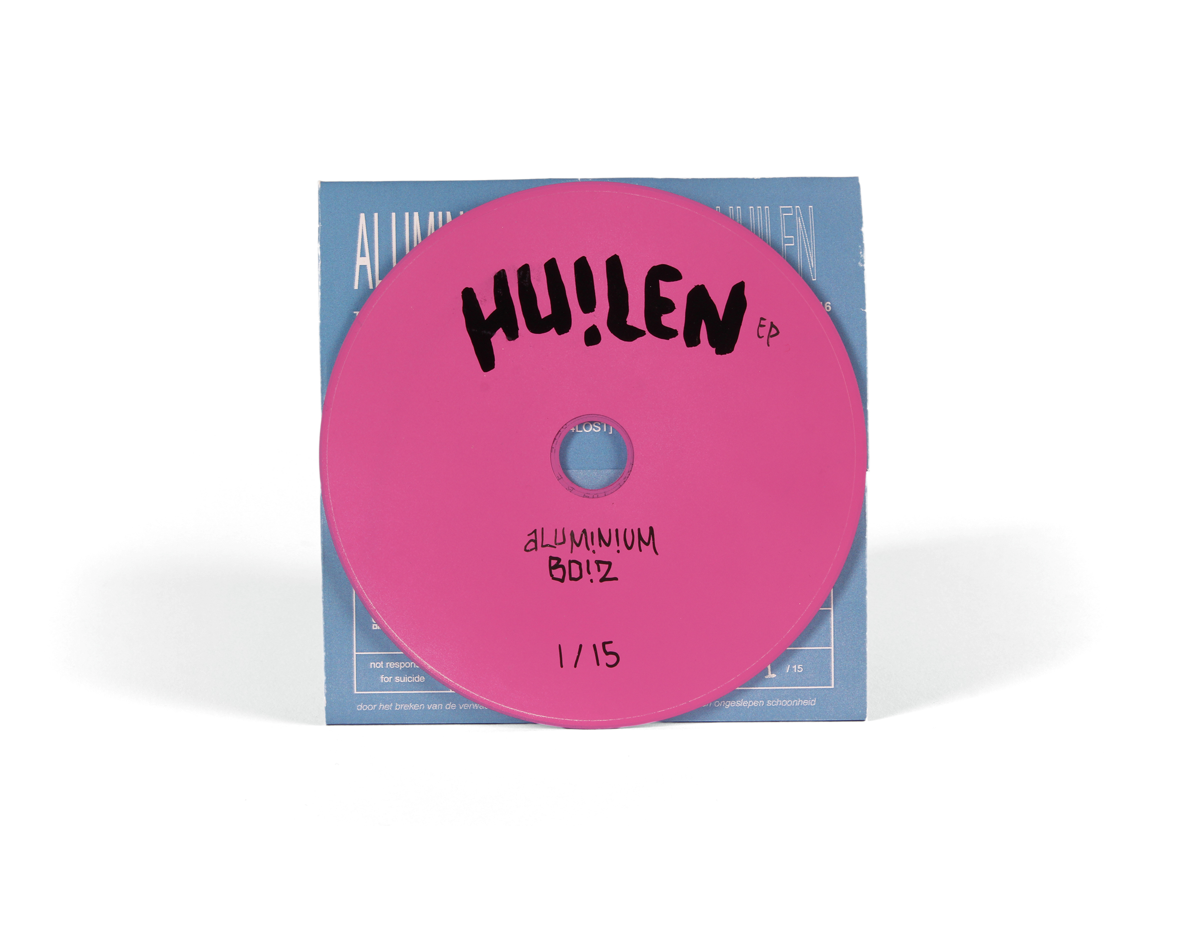
The second EP from aluminiumboiz, called the HUILEN EP which translates to "crying" is the oposite of the HAM EP, it reflects on the gloomy days. To reflect that into a visual image I've created vision straighti out of a distorted dream, a comfortable numbness within a disintegrating emptyness.
The second EP from aluminiumboiz, called the HUILEN EP which translates to "crying" is the oposite of the HAM EP, it reflects on the gloomy days. To reflect that into a visual image I've created vision straight of a distorted dream, a comfortable numbness within a disintegrating emptyness.
The second EP from aluminiumboiz, called the HUILEN EP which translates to "crying" is the oposite of the HAM EP, it reflects on the gloomy days. To reflect that into a visual image I've created vision straight of a distorted dream, a comfortable numbness within a disintegrating emptyness.
RGB vs. CMYK
To make sure that the contrast of the original cover design for the release didn't change when creating the physical copy, I've experimented with printing the cover and changing some value's of excisting layers - but also creating new layers. So that I could achive a physical versions that stayed true to the design made for a digital enviroment only.
RGB
CMYK

RGB

CMYK
SHIRTS
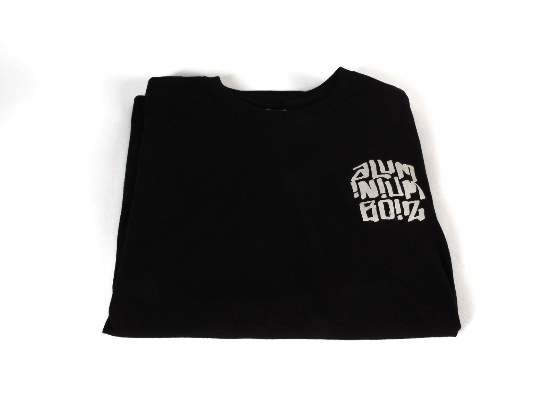
For the promotion of the aluminiumboiz I've also created t-shirts with the logo on top. The idea behind a design this simple was to focus on the promotion of the rap group and to have a easy but also straight forward wearable product.

PROTOTYPE
PROTO-TYPE
PROTO-TYPE
PROTOTYPE
To create a physical form of a digital product I've created multiple tests to make sure the final product stayed true to the colors and vision of the original product. This required different prototypes.
To create a physical form of a digital product I've created multiple tests to make sure the final product stayed true to the colors and vision of the original product. This required different prototypes.
To create a physical form of a digital product I've created multiple tests to make sure the final product stayed true to the colors and vision of the original product. This required different prototypes.
To create a physical form of a digital product I've created multiple tests to make sure the final product stayed true to the colors and vision of the original product. This required different prototypes.
RESULTS
RE-
SULTS
RE-SULTS
RESULTS
In the end I created a cheap but unique design and package for the release of the HAM and HUILEN EP by aluminiumboiz. I did find some small design and spelling mistakes at the end which did bum me out.
In the end I created a cheap but unique design and package for the release of the HAM and HUILEN EP by aluminiumboiz. I did find some small design and spelling mistakes at the end which did bum me out.
In the end I created a cheap but unique design and package for the release of the HAM and HUILEN EP by aluminiumboiz. I did find some small design and spelling mistakes at the end which did bum me out.
In the end I created a cheap but unique design and package for the release of the HAM and HUILEN EP by aluminiumboiz. I did find some small design and spelling mistakes at the end which did bum me out.
CONCLUSION
CON-CLUSION
CON-CLUSION
CONCLUSION
Creating the design for the package was in my opinion the most interesting part of this case. However, in the future I must pay more attention in the progress to elliminate such small errors.
Creating the design for the package was in my opinion the most interesting part of this case. However, in the future I must pay more attention in the progress to elliminate such small errors.
Creating the design for the package was in my opinion the most interesting part of this case. However, in the future I must pay more attention in the progress to elliminate such small errors.
Creating the design for the package was in my opinion the most interesting part of this case. However, in the future I must pay more attention in the progress to elliminate such small errors.
OTHER CASES

MyFoodSmart Solution
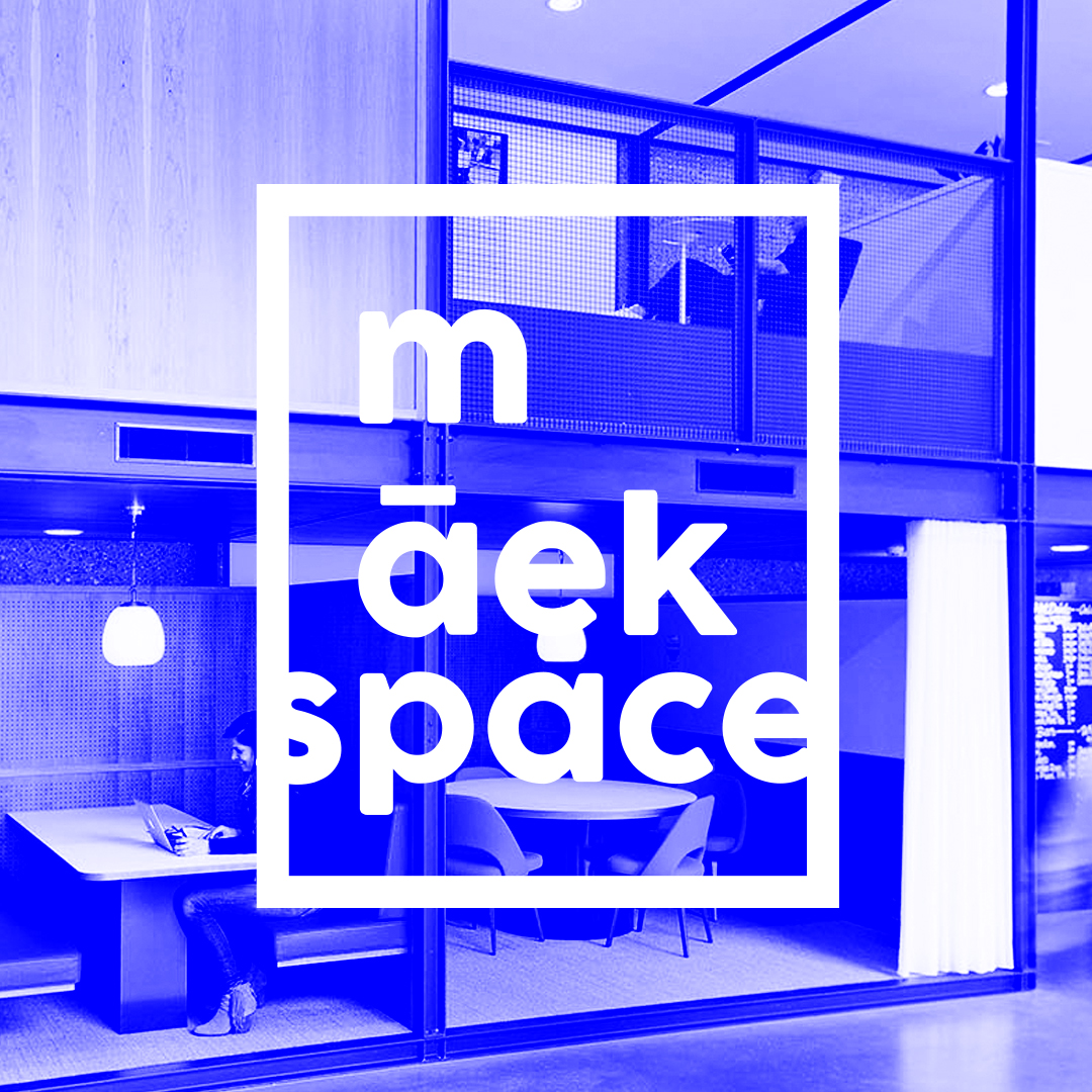
maekBusiness Strategy
AluminiumboizBranding & Visual Identity
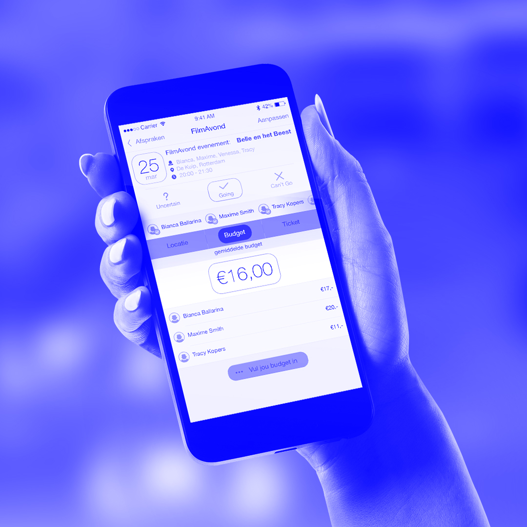
NightOutMobile Application and Screen Design
IllustrationsIllustrations & Visualisation
NintendoBranding Analysis

VodafoneVisual Design
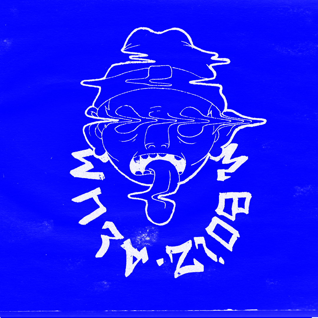
KlonkKomiksIllustrations & Storytelling
EDUCATION
2007 - 2011
Grafisch Lyceum, Rotterdam VMBO 3
2011 - 2015
Grafisch Lyceum, Rotterdam MBO 4
Interaction & Media Design
2016
Hoge School, Rotterdam HBO
Communication & Media Design
2018
Hoge school, Rotterdam HBO
Minor in User Interface and Experience Design
SKILLS
Web & Print Design
UI & UX Design
Photo Manipulation & Restoration
Communication Design
Information Architecture
Illustration
PILLOWSOPHY
We designers create, be it art or sollutions to problems, from local small scale shops, to big businesses though out the country or operating internationally. It start with an idea and ends with a feeling and message. Born to stimulate the visual sense of our fellow human beings. We design for the mind.
DESIGNED FOR THE MIND
ALL WORK BY © 2016 / 2019 BARK MILE ( MARK BIJL)